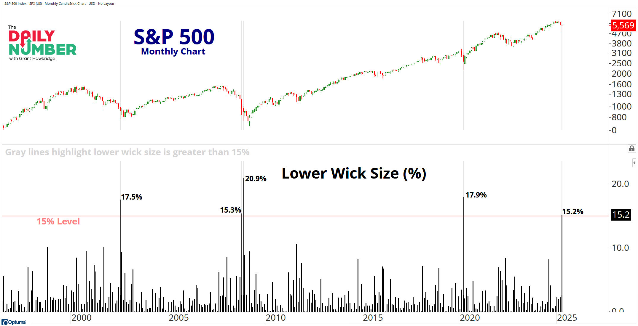
The size of the lower wick for the S&P 500 in April was 15.2%.
Here’s the chart:
Let's break down what the chart shows:
The greenand red candlesticks in the top panel is the S&P 500 index price.
The black bars in the bottom panel represent the size of the lower wick in percentage terms.
The Takeaway: What is a wick?
A wick refers to the lines on a candle in a candlestick chart. A wick indicates the fluctuations of a stock's price in relation to its opening and closing prices.
A lower wick indicates how much sellers drove the price down, followed by buyers stepping in with a significant response. Typically, when we see a long lower wick, it signals a potential transition from a bearish to a bullish environment.
It's a valuable tool for us to understand market psychology and potential trend shifts.
In April, the S&P 500 showed a significantly large lower wick, measuring over 15.2% in size. Other instances of wicks this substantial were observed in March 2020, November 2008, and July 2002. Wicks of this magnitude typically indicate that buyers are actively engaged and committed. These lower wick moves occurred at critical turning points in the market.
Will this lower wick in the S&P 500 differ from other lower wicks we've observed over the past two decades?
Grant Hawkridge | Chief Aussie Operator, All Star Charts
PS:Kenny Glick opened his Hit The Bid trading room up to the public yesterday for free. Kenny's sale ended last night but you can still call Mary at323-421-7910or email her atmary@stockmarketmedia.comto get his 15% discount.
If you find my content valuable, I would greatly appreciate it if you could share it with your friends, family, and colleagues. Your help in spreading the word is invaluable in supporting our work. Thank you to all of you who share!