The Indexes Are Hiding the Truth 🤫 The Chart Report

Chart of the Day
🏆 Today's Chart of the Day was shared by David Cox.
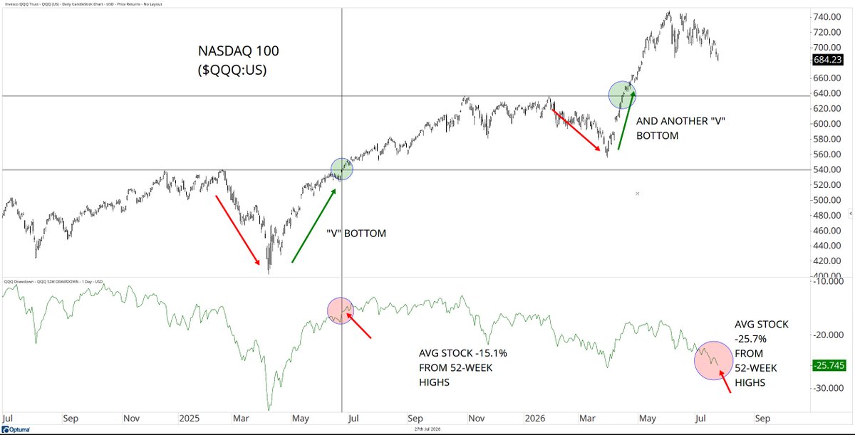
The major indexes have done an incredible job masking the volatility taking place beneath the surface this year.
While the Nasdaq 100 is down 8.5% from its highs, the average Nasdaq 100 stock has fallen more than 25% from its 52-week high, with semiconductors also entering a 20% correction.
The S&P 500 Constituent Volatility Index, or the "average stock" volatility index, has climbed to its highest levels in over a year, highlighting the disconnect between index-level stability and individual stock volatility.
The Takeaway: Stocks have experienced far more pain than the indexes suggest.
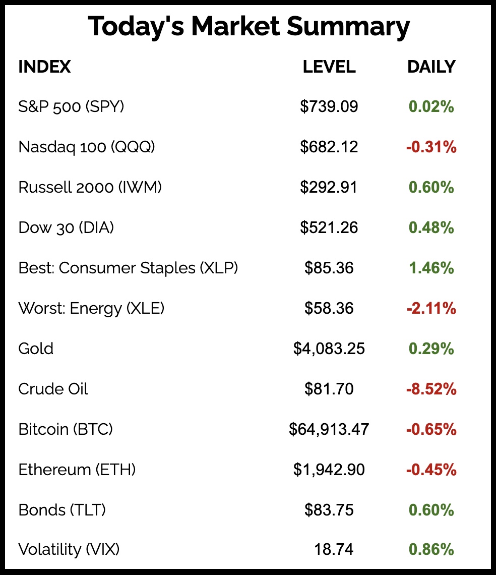
More Great Charts
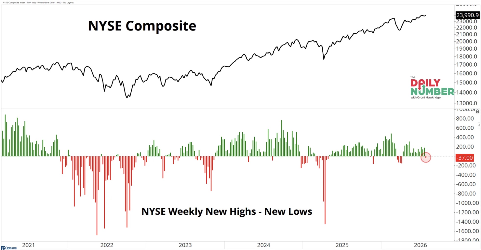
More NYSE stocks made new 52-week lows than new 52-week highs last week, marking the first negative breadth reading after 15 consecutive weeks of positive readings.
Read the complete analysis from Grant Hawkridge.

The S&P 500 Advance-Decline Line bounced from a confluence of support.
Check out the whole post from Ryan Detrick.
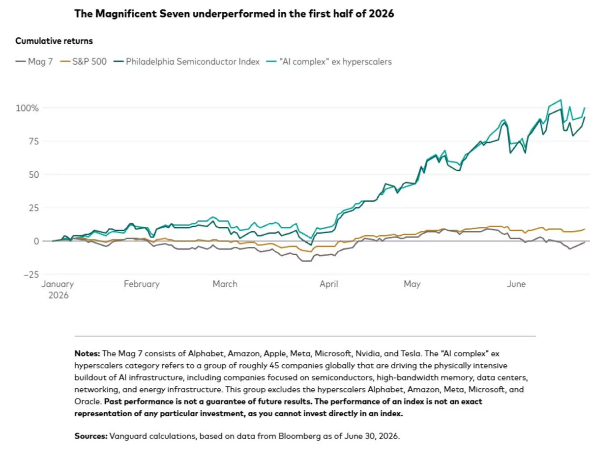
This year we've seen leadership shift away from the Magnificent Seven and toward the infrastructure powering AI.
View the full tweet from Schaeffers via research from Vanguard.
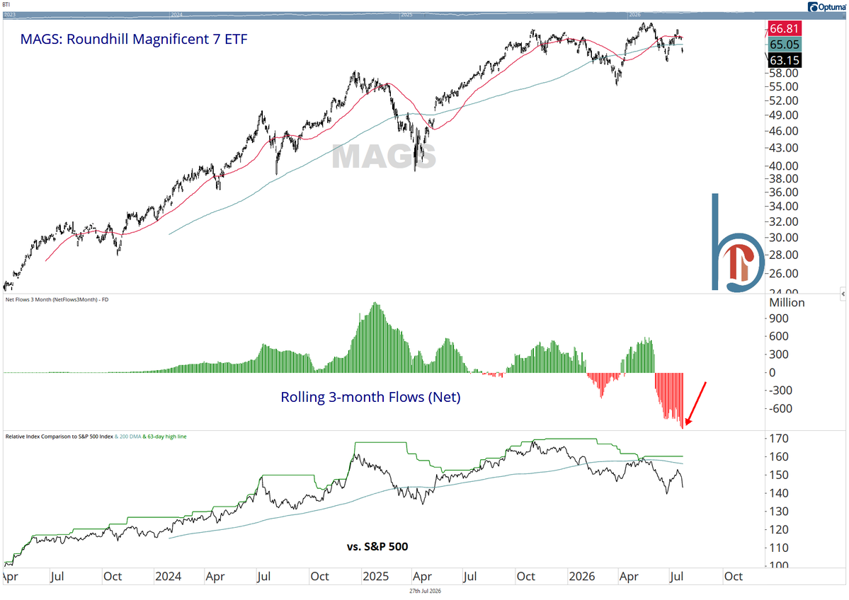
Three-month outflows from the Magnificent Seven point to a record rotation out of the group.
Examine the entire post from Scott Brown.
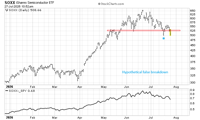
Semiconductors are breaking down from a head-and-shoulders top after a brief pattern failure.
See the whole tweet from Mark Ungewitter.
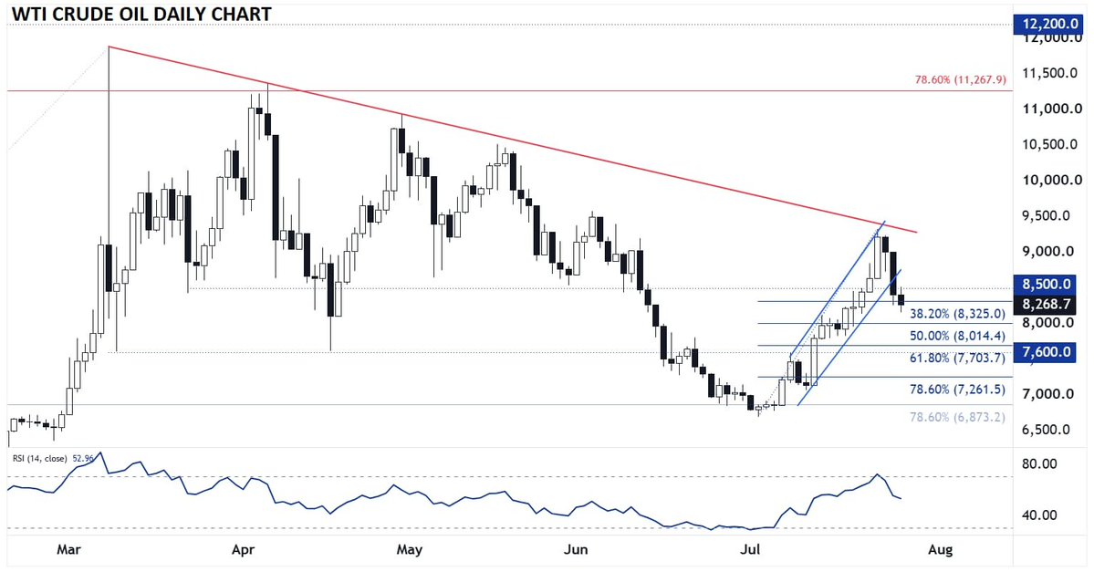
WTI Crude Oil reversed lower late last week after rallying into the bearish trendline formed from the highs early in the U.S.-Iran conflict.
Read the complete analysis from Matt Weller.
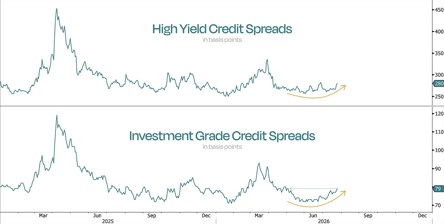
Credit spreads have begun to widen and are nearing a potential breakout level.
Check out the latest article from Duality Research.
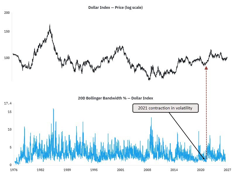
Bollinger Bandwidth in the U.S. Dollar Index is at its tightest since 2021, just before the dollar launched into a major advance.
View the entire post from Turning Point Market Research.
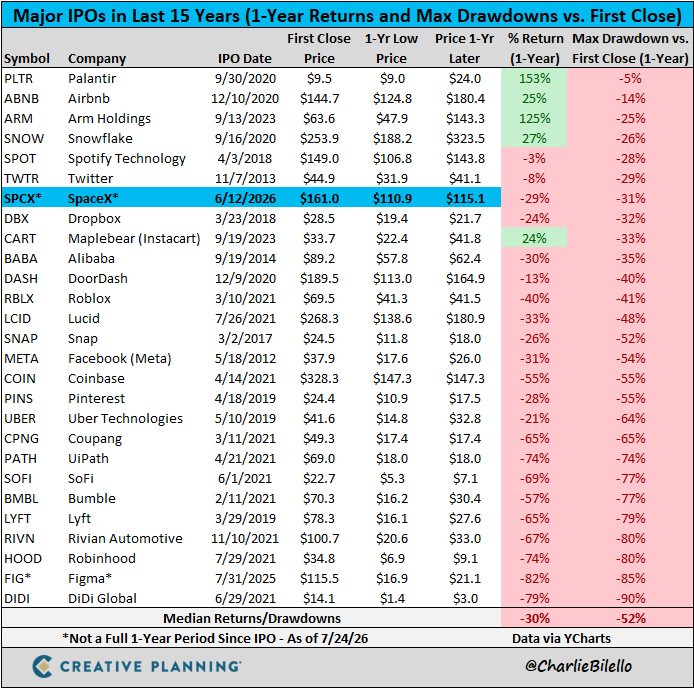
After a historic debut, SpaceX is beginning to resemble the post-IPO performance of other major listings.
See the full tweet from Peter Mallouk.
The Chart Report curates best-in-class technical analysis from across the web.
If you’d like to share a chart or just say hello, email us at [email protected]