Sponsored By:

Today’s Summary
Thursday, March 14th, 2019
Indices: US stocks closed relatively flat, with the Dow Jones Industrial Average inching higher by just 7 points or 0.03%. The S&P 500, Nasdaq and Russell 2000 all finished down. The Russell was the worst performer of the bunch, closing down 0.40%.
Sectors: Financials led, with a gain of 0.38%, while Materials lagged, falling 0.75%.
Commodities: WTI Crude Oil futures gained 0.5% to settle at $58.59 per barrel, the highest level its seen in 2019. Gold futures fell 1.1% to settle below the $1,300 level at $1,295 per ounce.
Currencies: The US Dollar Index was slightly higher, by 0.18%.
Here are some of the best charts, articles, and ideas being shared on the web today!
Chart of the Day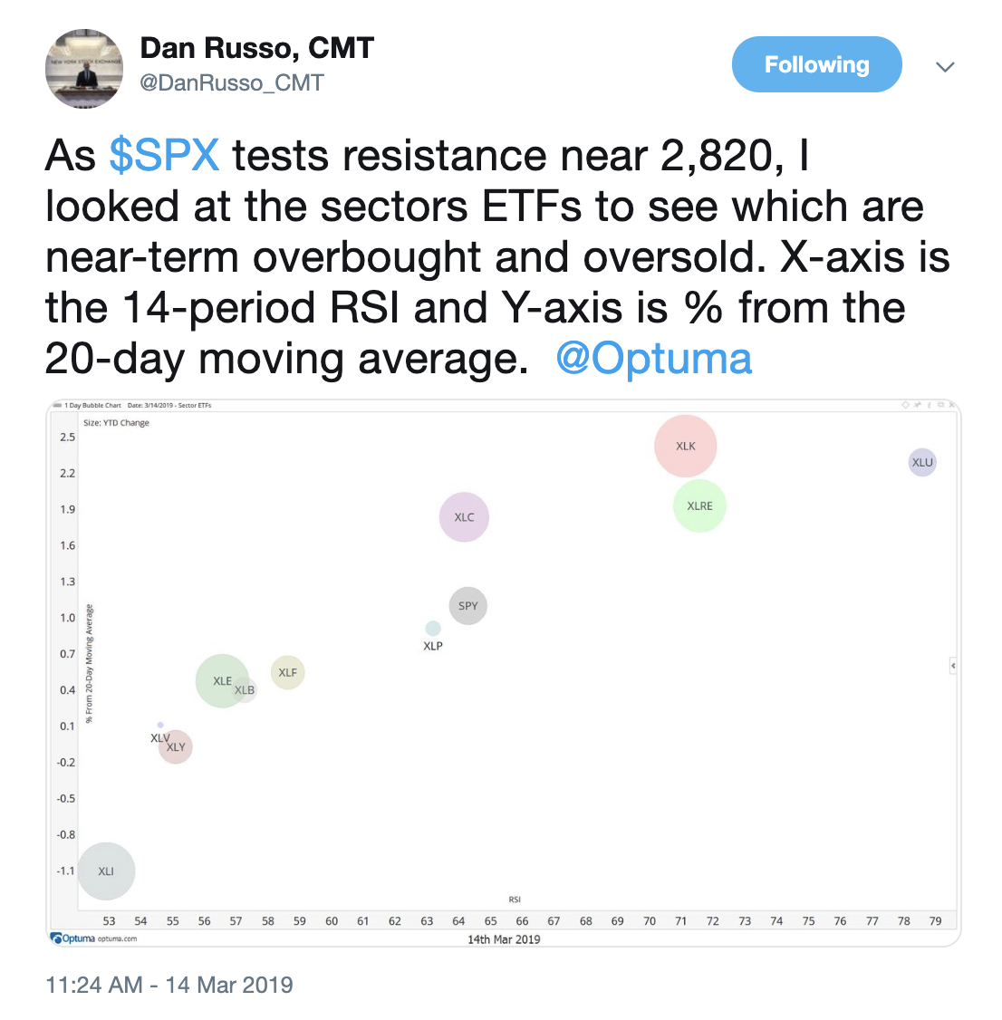
Today’s chart of the day was shared on Twitter by Dan Russo, @DanRusso_CMT. It’s a bubble chart of the 11 sector ETFs of the S&P 500, along with $SPY as a benchmark. The bubbles are sized based on YTD % return. The X-axis is a 14-period RSI (momentum), while the Y-axis represents how far extended each sector ETF is from the 20-day moving average. In other words, The further toward the top right corner, the more overbought. Conversely, the further toward the bottom left corner of the chart, the more oversold. The Utilities sector is especially hot and may need to cool down. On the other hand, the weakness in Industrials might be overdone at this point.
Quote of The Day
“The stock market is the story of cycles and of the human behavior that is responsible for the overreactions in both directions”
– Seth Klarman (American Hedge Fund Manager)
Top Links
What the Weight of the Evidence Suggests for U.S. Interest Rates – The Chart Report
In this post, we take a look at the U.S. 10-year Treasury Yield and how it compares to the 10-year yields of other G7 nations. We feature what technicians like John Roque and J.C. Parets are saying about the direction of interest rates.
Tech Stocks Take the Lead – The Chart Report
Here’s a piece from The Chart Report, highlighting Todd Sohn’s thoughts on the Technology sector right now. He thinks Apple has found a bottom and is encouraged by the plethora of bearish analyst ratings.
Less Optimism Among Individual Investors – Bespoke
This short note from Bespoke breaks down this weeks AAII survey of individual investors.
The Role of Collaboration in My Process – Tom Bruni – All Star Charts
We really like this post from Tom Bruni of All Star Charts. He explains why collaborating with others and sharing your work is important in technical analysis.
These Two Sectors Just Quietly Set Records – Mark Newton – CNBC
Technician, Mark Newton made an appearance on CNBC on Wednesday to discuss the recent strength from two defensive sectors, Utilities and Real Estate. He doesn’t expect the strength to continue for these two groups.
$SPX 2010 kind of looks like today's price action since January 2018. I remember getting fooled by the H&S back then. Interesting comparison. And yes, I know there are differences. pic.twitter.com/Vfwwg01GBG
— Mark Arbeter, CMT (@MarkArbeter) March 14, 2019
I hope you like this $SPX range.
A lot. pic.twitter.com/60EOnFIvnt
— OddStats (@OddStats) March 13, 2019
I promise Im not a permabear even if most of the content lately has had a negative slant. But charts like these still concern me. Some real technical damage was done over the last year and we're not yet out of danger. Weakness here would not be good. $SPY $NYSE #stocks pic.twitter.com/3Ym6rvPawm
— Andrew Adams CFA, CMT (@DayTraderGator) March 14, 2019
"Thinking about buying Snapchat once it starts trading after the IPO?"
"No, I'd rather own something less risky and more reliable, like GE."$SNAP vs $GE since Snap's IPO… pic.twitter.com/CQf1HguTcL
— Michael Santoli (@michaelsantoli) March 14, 2019
Not trolling, just asking. $XRP pic.twitter.com/xNnAj4ozhf
— Peter Brandt (@PeterLBrandt) March 14, 2019
yields all over the world are making new lows. why should we expect U.S. rates to rise? thanks @KoyfinCharts for the clean charts $TNX $TLT $BUND pic.twitter.com/GVs5kamaTR
— J.C. Parets (@allstarcharts) March 14, 2019
Why studying past price action is useful? It helps you to put the recent chart pattern development in perspective. In other words it helps you to understand the significance of the latest consolidation relative to those that took place in the past. >> https://t.co/3PXD6BGq77 pic.twitter.com/1tZf82YAWU
— Aksel Kibar, CMT (@TechCharts) March 14, 2019
$365 level matters for BA
@sstrazza on the chart work pic.twitter.com/lE6HxKfFIk— Jonathan Bloom (@Bloom_Trading) March 14, 2019
People get obsessed with predicting the next bear market and become content being 1+years early in their calls.
Which makes me love this chart, which shows stocks have some of their best returns just before a bear market occurs.
via US Global Investors pic.twitter.com/aWZzAUFRu7— Andrew Thrasher, CMT (@AndrewThrasher) March 14, 2019
Mystery Chart Reveal "Avoiding These Groups At The Index Level" on @allstarcharts
My first post as an official CMT, pretty cool @CMTAssociationhttps://t.co/jNoV4O2QRk pic.twitter.com/ajPWbMLCYy
— Tom Bruni, CMT (@BruniCharting) March 14, 2019