Sponsored By:

Today’s Summary
Monday, April 15th, 2019
Indices: US stocks were slightly lower today, with the Dow Jones Industrial Average closing down 28 points or 0.11%. The Russell 2000 was the weakest among the major indices, falling 0.41%.
Stocks: Goldman Sachs ($GS) sold off nearly 4% today on the heels of its Q1 earnings release. After breaking above its YTD range last week, we now have what looks to be a failed breakout.
Sectors: Consumer Staples led, gaining 0.59%. Real Estate lagged, falling 0.68%.
Commodities: WTI Crude Oil futures were lower by 0.59% to settle at $63.51 per barrel. Gold futures moved lower by 0.33% to settle at $1291 per ounce.
Currencies: The US Dollar Index was relatively flat, changing just 0.04%.
Interest Rates: The US 10-year Treasury yield slipped to 2.556%.
Here are some of the best charts, articles, and ideas being shared on the web today!
Chart of the Day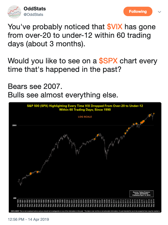
Today’s chart of the day was shared on Twitter by @OddStats. It’s a long-term chart of the S&P 500 with orange markings for every time the Volatility Index ($VIX) went from over 20 to under 12 within 60 trading days. A lot of folks are talking about the VIX and think it has come down too far too fast. This chart is a good answer to those fears as it proves that the collapses in volatility are perfectly normal in bull markets. It acted as a decent warning sign at the market top in 2007, however, it happened numerous times since then without any bearish consequences.
Quote of The Day
“Headlines, in a way, are what mislead you. Because bad news is always a headline and gradual improvement is not”
– Bill Gates (Founder of Microsoft)
The Dow Jones Industrial Average Today – All Star Charts
In this piece, JC Parets does an in-depth chart analysis of the 30 components of the Dow Jones Industrial Average.
Dogs of the Dow 2019 – Bespoke
This note from Bespoke takes a look at how the famous Dogs of the Dow Strategy has fared so far in 2019. This buy-and-hold strategy tracks the performance of the 10-highest dividend yielding Dow components each year.
S&P 500 Chart Storm – Callum Thomas – Topdown Charts
Here’s Callum Thomas’ weekly chart storm where he gives his market outlook and takes a look at sentiment among market participants. This piece is packed with interesting charts.
A Quick Look Into Healthcare – MurphyCharts
This post from Shane Murphy is a deep dive into the Healthcare sector. He takes a look at a few different charts and highlights the underperformance from the group.
Strategas’ Chris Verrone on Why Disney is a Good Stock for the Long-Term – CNBC
On Friday, shares of Disney ($DIS) broke out to new all-time highs and had their best day in nearly a decade. Chris Verrone was on CNBC this morning making the case for being long and describes the chart as something technicians dream about.
Top 10 Tweets
April has been the best month of the year for the S&P 500 over the past 20 years.
What is even more interesting is the majority of those gains started today. pic.twitter.com/XcvkQ07Neu
— Ryan Detrick, CMT (@RyanDetrick) April 15, 2019
Myth buster. Extremely low volatility has not signaled important tops in any consistent manner. $SPX $VIX pic.twitter.com/tKBVx2E8U4
— Mark Ungewitter (@mark_ungewitter) April 15, 2019
So if the correction and rally was because of the "trade war".. can we call it a wash? Or would that trigger too many people?
If we roll over into a bear market: the trade war caused it. If we break out to new ATHs: Media will find the next fear mongering story.. $SPY pic.twitter.com/bAUfIvNFMS
— Nick Marino (@AlphaEyeCharts) April 15, 2019
21-session correl between the daily changes in U.S. stocks and crude oil has reaaaaaallly picked up recently. pic.twitter.com/qIsjc9RtgT
— Luke Kawa (@LJKawa) April 15, 2019
After an initial bounce in early 2019, the weekly new high list on the NYSE+NASDAQ has stalled (and actually ticked lower last week despite the across board index-level gains). pic.twitter.com/EqNvS3rmNx
— Willie Delwiche (@WillieDelwiche) April 15, 2019
Semis were laggards all day today. $SMH pic.twitter.com/KR7PbaNI22
— Bespoke (@bespokeinvest) April 15, 2019
Chart patterns repeat in different markets, time frames and instruments. Driving force behind each chart configuration is interaction between buyers and sellers based on different factors but same emotions. We identify those as certain chart formations. #ascendingtriangle pic.twitter.com/UX53Y1gdcK
— Aksel Kibar, CMT (@TechCharts) April 15, 2019
3rd trendline break since 2009.
$SPX pic.twitter.com/YlxOAVNkvt— Arun S. Chopra CFA CMT (@FusionptCapital) April 14, 2019
This $LYFT … sheesh. That's a lot of $$ being lost in a short amount of time for a big-name #tech #IPO pic.twitter.com/dr8en8qyEh
— Mike Larson (@RealMikeLarson) April 15, 2019
This is my summary of the market so far this year. pic.twitter.com/NCS3RtcMzE
— Joe Weisenthal (@TheStalwart) April 15, 2019