The Line Bulls Can't Afford to Lose 📈 The Chart Report

Chart of the Day
🏆 Today's Chart of the Day was shared by CyclesFan.
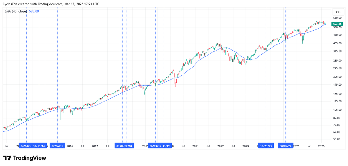
For the past decade, the 40-week moving average has been the dividing line between opportunity and trouble for the Nasdaq 100.
After multi-week declines, each successful retest has went on to produce a new all-time high.
Conversely, when QQQ closes below the 40-week, it has led to more meaningful corrections and drawdowns of at least 18%.
The Takeaway: The Nasdaq 100 is holding its 40-week moving average, but a break below would open the door to significantly more downside.
More Great Charts
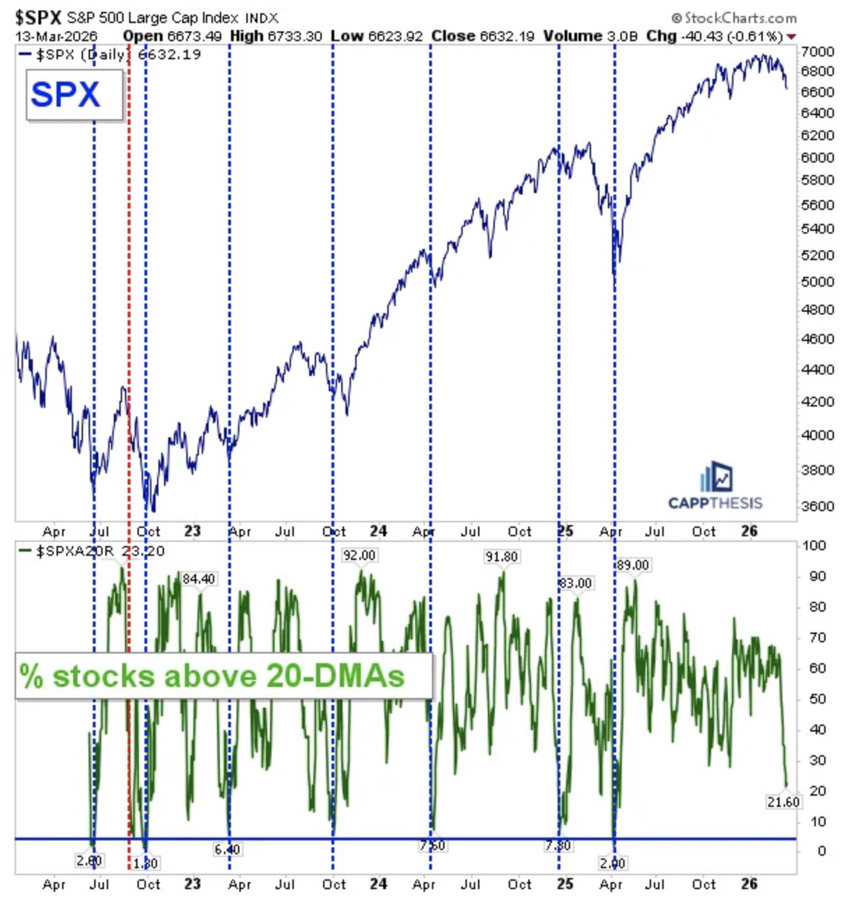
For the S&P 500, readings below 8% in the percentage of stocks above their 20 day moving average have coincided with pauses or major lows.
We’re close, but not there yet.
Access the full breakdown from Frank Cappelleri.
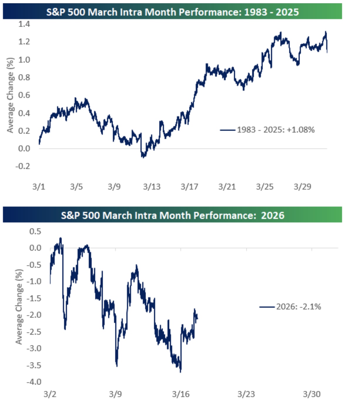
Historically, the S&P 500 has traded relatively flat into mid-March before strengthening into the back half of the month.
Read the complete analysis from Bespoke.
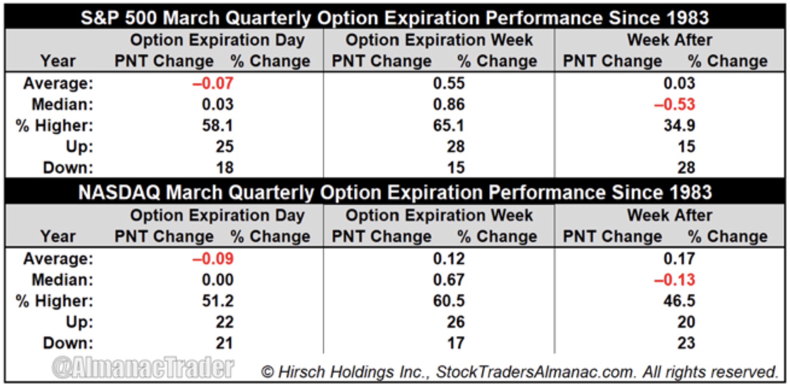
March quarterly options expiration weeks have typically been bullish, with the S&P 500 up 28 times in the past 43 years and the Nasdaq advancing 26 times.
See the full stats from Jeff Hirsch.
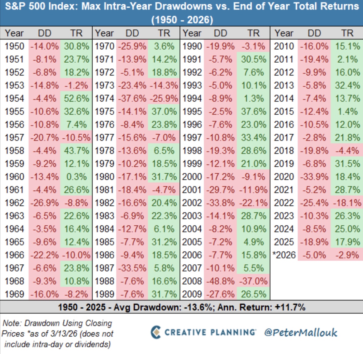
Over the past 75 years, the average intra-year drawdown for the S&P 500 has been about 14%.
Volatility is the toll we pay to invest.
View the whole post from Peter Mallouk.
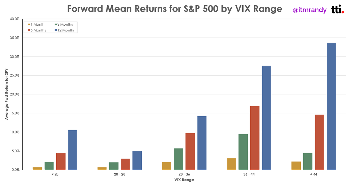
Ranges between 20 and 28 for the VIX have been associated with weaker forward returns for the S&P 500.
Check out the entire tweet from Randy Dunham.
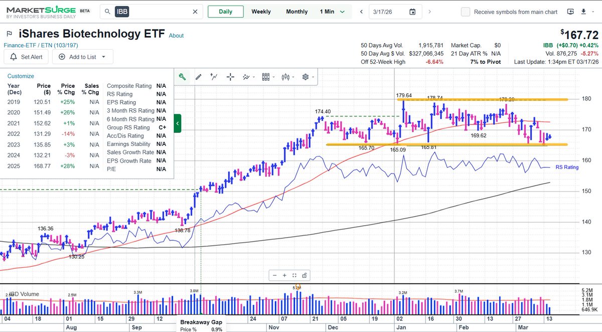
Biotech stocks continue to digest last year’s rally and are holding the lower end of their range just below 170.
See the full post from Evan Medeiros.
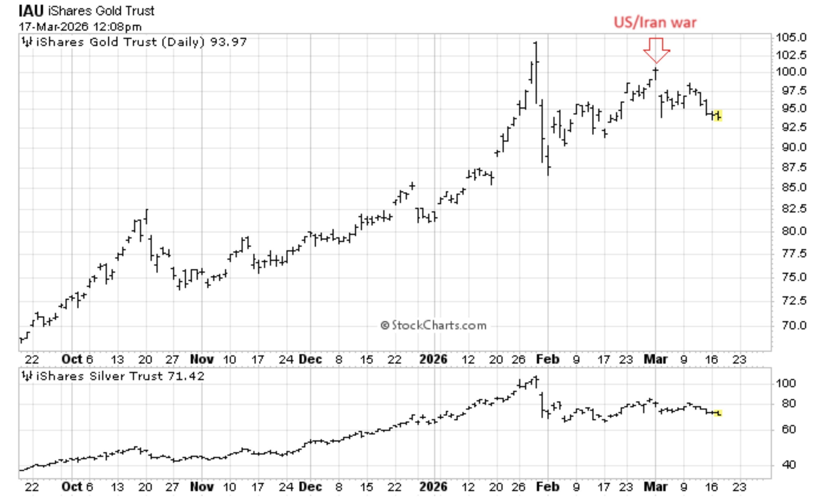
Gold and Silver have struggled to advance amid geopolitical uncertainty.
View the whole tweet from Mark Ungewitter.
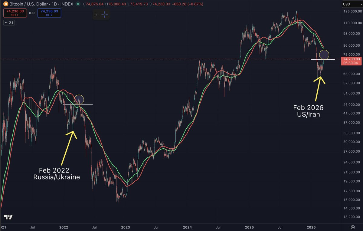
Are we about to see the same geopolitical scenario play out for Bitcoin?
Check out the complete post from Benjamin Cowen.
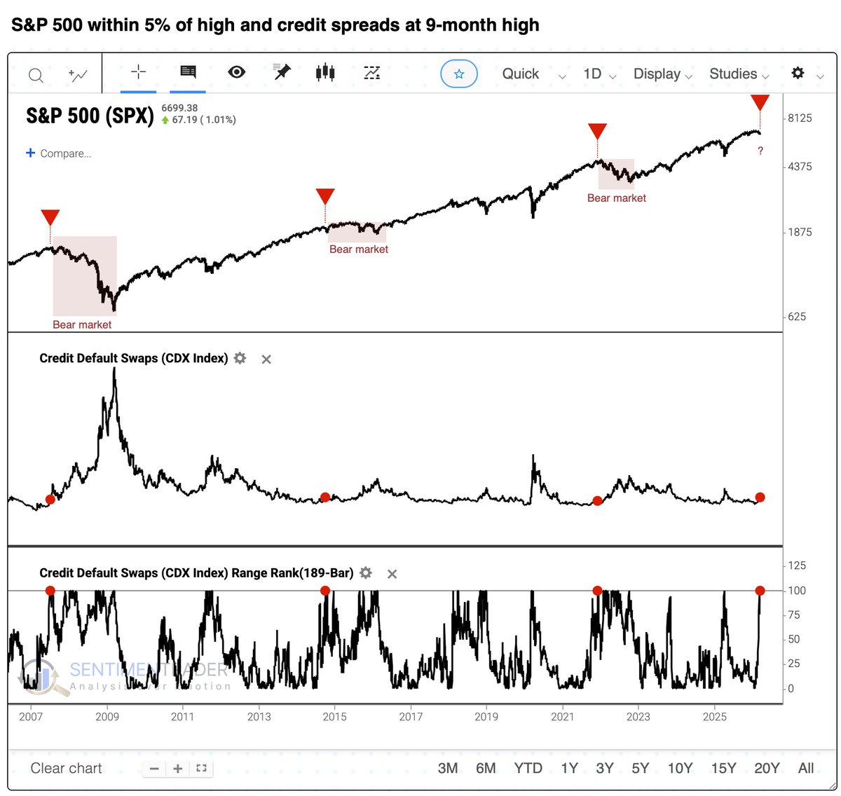
Over the past 20 years, every time credit spreads made 9-month highs while the S&P remained within 5% of its high, a bear market followed.
See the entire tweet from Jason Goepfert.
The Chart Report curates best-in-class technical analysis from across the web.
If you’d like to share a chart or just say hello, email us at [email protected]